Our Favorite Neutrals for 2025
Date
July 9, 2025
Category
Trends
Reading time
5
minutes
Introduction
Neutral colors have always been a staple in interior design, offering a versatile and calming backdrop for any space. In 2025, neutrals evolve beyond simple beige and gray—bringing fresh warmth, subtle undertones, and sophisticated depth. Let’s explore the favorite neutral shades shaping interiors this year and how to use them for timeless yet modern rooms.
Why Neutrals Matter
Neutrals create balance, making spaces feel open and inviting. They act as the perfect canvas for layering textures, bold accents, and natural elements. Whether you’re refreshing a room or designing from scratch, neutrals allow flexibility, longevity, and effortless style.
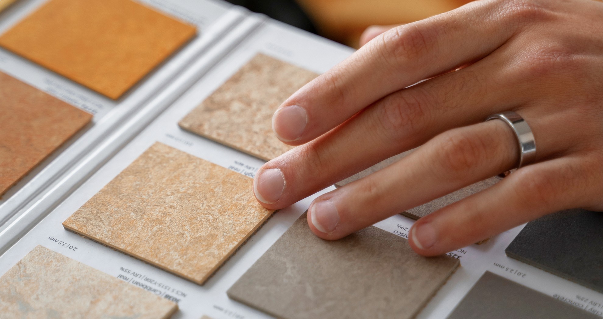
Top Neutral Colors for 2025
Warm Greige:
A cozy blend of gray and beige that adds softness without being cold. Perfect for living rooms and bedrooms.
Earthy Taupe:
Rich and grounding, taupe brings a touch of nature inside, pairing beautifully with wood and greenery.
Soft Ivory:
An off-white shade with creamy undertones that brightens spaces while maintaining warmth.
Muted Sage:
A gentle green-gray neutral that brings tranquility and pairs well with natural textures.
Dusty Blush:
A subtle pinkish-beige that adds warmth and a hint of color without overwhelming.
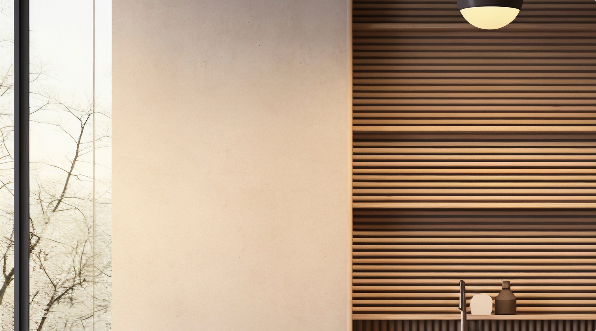
How to Use These Neutrals
Layer Textures:
Mix matte and glossy finishes, soft fabrics, and natural materials for depth.
Add Accent Colors:
Use bold hues like navy, mustard, or charcoal to complement neutrals.
Balance Warm and Cool:
Combine warm neutrals with cooler shades or metals to create harmony.
Incorporate Natural Elements:
Wood, stone, and plants work beautifully with these neutral palettes.
Explore the top neutral shades defining 2025—timeless, warm, and effortlessly stylish palettes perfect for every modern interior.
Impact on user experience
Neutral colors significantly enhance user experience by creating calming, comfortable environments that promote relaxation and focus. Their versatility allows for easy personalization, adapting to changing tastes without overwhelming the senses. Neutrals foster a sense of balance and harmony, making spaces feel open, welcoming, and timeless—supporting both everyday living and lasting emotional well-being.
Top Neutral Colors for 2025
Warm Greige:
A cozy blend of gray and beige that adds softness without being cold. Perfect for living rooms and bedrooms.
Earthy Taupe:
Rich and grounding, taupe brings a touch of nature inside, pairing beautifully with wood and greenery.
Soft Ivory:
An off-white shade with creamy undertones that brightens spaces while maintaining warmth.
Muted Sage:
A gentle green-gray neutral that brings tranquility and pairs well with natural textures.
Dusty Blush:
A subtle pinkish-beige that adds warmth and a hint of color without overwhelming.
How to Use These Neutrals
Layer Textures:
Mix matte and glossy finishes, soft fabrics, and natural materials for depth.
Add Accent Colors:
Use bold hues like navy, mustard, or charcoal to complement neutrals.
Balance Warm and Cool:
Combine warm neutrals with cooler shades or metals to create harmony.
Incorporate Natural Elements:
Wood, stone, and plants work beautifully with these neutral palettes.
Explore the top neutral shades defining 2025—timeless, warm, and effortlessly stylish palettes perfect for every modern interior.
Impact on user experience
Neutral colors significantly enhance user experience by creating calming, comfortable environments that promote relaxation and focus. Their versatility allows for easy personalization, adapting to changing tastes without overwhelming the senses. Neutrals foster a sense of balance and harmony, making spaces feel open, welcoming, and timeless—supporting both everyday living and lasting emotional well-being.

Our Favorite Neutrals for 2025
Date
July 9, 2025
Category
Trends
Reading time
5
minutes
Introduction
Neutral colors have always been a staple in interior design, offering a versatile and calming backdrop for any space. In 2025, neutrals evolve beyond simple beige and gray—bringing fresh warmth, subtle undertones, and sophisticated depth. Let’s explore the favorite neutral shades shaping interiors this year and how to use them for timeless yet modern rooms.
Why Neutrals Matter
Neutrals create balance, making spaces feel open and inviting. They act as the perfect canvas for layering textures, bold accents, and natural elements. Whether you’re refreshing a room or designing from scratch, neutrals allow flexibility, longevity, and effortless style.
Introduction
Neutral colors have always been a staple in interior design, offering a versatile and calming backdrop for any space. In 2025, neutrals evolve beyond simple beige and gray—bringing fresh warmth, subtle undertones, and sophisticated depth. Let’s explore the favorite neutral shades shaping interiors this year and how to use them for timeless yet modern rooms.
Why Neutrals Matter
Neutrals create balance, making spaces feel open and inviting. They act as the perfect canvas for layering textures, bold accents, and natural elements. Whether you’re refreshing a room or designing from scratch, neutrals allow flexibility, longevity, and effortless style.
Introduction
Neutral colors have always been a staple in interior design, offering a versatile and calming backdrop for any space. In 2025, neutrals evolve beyond simple beige and gray—bringing fresh warmth, subtle undertones, and sophisticated depth. Let’s explore the favorite neutral shades shaping interiors this year and how to use them for timeless yet modern rooms.
Why Neutrals Matter
Neutrals create balance, making spaces feel open and inviting. They act as the perfect canvas for layering textures, bold accents, and natural elements. Whether you’re refreshing a room or designing from scratch, neutrals allow flexibility, longevity, and effortless style.
Top Neutral Colors for 2025
Warm Greige:
A cozy blend of gray and beige that adds softness without being cold. Perfect for living rooms and bedrooms.
Earthy Taupe:
Rich and grounding, taupe brings a touch of nature inside, pairing beautifully with wood and greenery.
Soft Ivory:
An off-white shade with creamy undertones that brightens spaces while maintaining warmth.
Muted Sage:
A gentle green-gray neutral that brings tranquility and pairs well with natural textures.
Dusty Blush:
A subtle pinkish-beige that adds warmth and a hint of color without overwhelming.
How to Use These Neutrals
Layer Textures:
Mix matte and glossy finishes, soft fabrics, and natural materials for depth.
Add Accent Colors:
Use bold hues like navy, mustard, or charcoal to complement neutrals.
Balance Warm and Cool:
Combine warm neutrals with cooler shades or metals to create harmony.
Incorporate Natural Elements:
Wood, stone, and plants work beautifully with these neutral palettes.
Explore the top neutral shades defining 2025—timeless, warm, and effortlessly stylish palettes perfect for every modern interior.
Impact on user experience
Neutral colors significantly enhance user experience by creating calming, comfortable environments that promote relaxation and focus. Their versatility allows for easy personalization, adapting to changing tastes without overwhelming the senses. Neutrals foster a sense of balance and harmony, making spaces feel open, welcoming, and timeless—supporting both everyday living and lasting emotional well-being.